Quantcast
Channel: The Topps Archives
Viewing all 623 articles
Browse latest View live

The Glorious Result Of A Mis-Spent Ute?

$
0
0
Happy New Year kids!  We are roaring into 2013 with a  look back over one hundred years ago, to about 1910.  And in a bit of a twist, it's a Bowman related post today, as in J. Warren Bowman, the man, the mystery, the merry-maker.

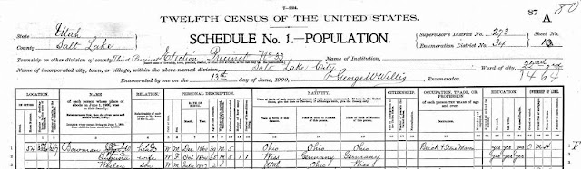
Leon Luckey, who runs Net54Baseball.com, the web's premiere pre-war card site (there is a lot of postwar stuff there too), and is a type colelctor of the the highest order, also collect ancillary items relating to the cards.  He has an Obak sample item from about 1910 that was addressed to one J.W. Bowman in Salt Lake City and it has had me pondering for a while now whether or not the addressee was, in fact, J.Warren Bowman.  Here, take a gander:


I know, I know what are the odds.  However, contemplate the fact that Warren Bowman, to use the familiar, lived in the American Southwest when he was younger and he would have been around 13 or so when Obak was sending out sample coffin nails.  Some genealogical research would be beneficial here and I poked around ancestry.com when I had a membership there last year but to no avail.  So what do you all think?  Warren or not Warren?


Un Warren-ted

$
0
0
Well cowpokes, it looks like the Obak mailer described here last time out was a bust, at least as far as J. Warren Bowman is concerned. Faithful reader Mark Aubrey writes:

"I've attached the 1900 US Census image from 54 Marion Street in Salt Lake City, Utah.  It is John W. Bowman (first line).:


I wish the outcome was more favorable to my hypothesis but alas! I think I will dig out a bit more on our man J. Warren Bowman this winter and post my findings soon.

The Birth Of The Modern

$
0
0
So I'm sitting here, chugging along on my upcoming tome (The Modern Hobby Guide to Topps Chewing Gum: 1938-56) and realize I haven't posted much here this year. Well, I can;t promise a long post to rectify this but I can promise an interesting one.

Friend o'the Archive Ken Meyer has sent along some scans of vintage Topps material and the one that really caught my eye was this one from 1952:


Yes, the new big size would indeed be all the rage!  And 24 packs of series one cards?  Nice....

I have to admit that while I love the really graphic box tops that started coming out shortly after this, there's something about this one I dig.  Perhaps it's the breathless prose or the newness of it all.  I dunno.

For those of you that have been following my hints, I have a rather massive publication on the early days of Topps that will be out soon.  There will be two versions if things go right: a free download (in color) and a black and white print-on-demand book for those that want a printed and bound version.  The latter will probably have less illustrations than the free download but they will be posted in a web album instead.

Timing is still a little hard to predict but February looks about right.  Watch this space!

Schlemiel Schlimazel

$
0
0
Every few months I post about some in house Topps productions used to pitch ideas by the Product Development team to the brass. Many of these mockups take existing cards and have added artwork or they take a photo from a third party and added a couple of design elements. One such mockup is for Laverne & Shirley, the long-running show from the 70's and early 80's.

Long thought of as very difficult test cards, these are clearly meant for in-house use only:


You can see here the blue border was stuck on since it's deteriorating.  The show logo and the word balloon are also add-ons, as is the photo itself-the whole thing is an art department creation.  This one is in a little better shape:


While very rare, these are not in the same category as tests and final proofs but are true corporate treasures from Topps. In fact, if you go to this Robert Edward Auctions listing from a while back, you can see these two cards on a presentation board.

Three other shows rumored to exist as cards: Green Acres, I Dream of Jeannie and F Troop, may in fact have been sighted as presentation board mockups.  Another rumored set is called Dixie but there was never a TV show by that name that I have been able to find. I want to keep digging for scans of those cards. SInce there wer no more than a handful made, they are quite elusive!


Christmas Seal

$
0
0
Your blogmeister picked up a neat item last week off the 'bay and while I thought it would answer a specific question I had instead it created a new one.

I have seen variants of these cards before and they are sometime birthday cards, sometimes not:


The card really just thick paper and is die cut around the seal and opens up to reveal something that makes a little more sense:


The setup almost makes me think this could have been a corporate greeting from Topps but I am not sure that's right.  The gum tab has a 1946 copyright on the wrapper and I would guess this is a late 40's card.

I would have bought the card no matter but was hoping it would indicate the greeting card manufacturer but alas all it has is this (still neat but not what I was looking for):


That is number 412 by the way.  I was expecting the maker to be either Barker Greeting Cards of Cincinnati, who had cut a deal with Topps to include Magic Photos in a line of greeting cards or Buzza-Cardozo which issued a line using Hoplaong Cassidy packs.  I still think Barker is the most likely as the Hoppy cards used bigger packs and the associated greeting cards had much better graphics.  There was also a birthday card that featured Varsity Football as well as an Easter gridiron variant and I am sure there are others out there.

So, my question now is: can anyone identify the manufacturer based upon the graphics and indicia on the back?

Track Work Ahead

$
0
0
Well, as I well suspected, I am not the only person out there who likes and collects the obscure Topps issues from even the most unknown sets. A while back I posted on a set of insert cards issued in 1970 called Racing Track Cards. These came with the Mini Model Cars of the same year and were designed to be put together like a puzzle to form a race track for the mini models. A collector named Bill Cox has been piecing together the race track and is just shy of being halfway there (21 cards comprise a full track):


I have traded him a piece he needs and am also going to nab a Soda Fountain Car Card from him, which I will show here of course once it's in my sweaty little hands.  Those were issued in the same packs as the race track pieces but there  are only 12 cards in that subset.

If anybody can help out with the remaining pieces for Racing Track Cards or the Soda Fountain Car , I can pass a message on to Bill.  I think it would be cool to see the completed track and he indictaes he has extra pieces to trade.

Hot Hot Hot!

$
0
0
In the summer of 1959, it was quite fashionable for the younger set to take a plain white T shirt and adorn it with an iron on patch.  Indeed, in the days before logo'd shirts ubiquitous, having your mom take her iron to create a fresh new look was practically the only way to show your devotion to a team or breakfast cereal.

Topps, which was still hawking premiums in their nickel packs of cards at this point, had long sold felt emblems, letter and numbers, decals and other sundry for a relative pittance and a handful of Bazooka wrappers to the denizens of kiddieland.   In 1959 Hot Iron Transfers of your favorite MLB team were the enticement, as thee scans (mostly)  from Columbia City Collectibles show:


That's actually the front of an envelope, which held a folded transfer.  Before we look at those, here is a fuzzy scan of the envelope's back:


Before they outsourced their premium fulfillment operations in the 1960's, Topps filled such orders with a small team of dedicated personnel in Bush Terminal.  The decals are typical of the time in that Topps created their own version of each team's logo, although these are closer to the real ones than many of their other attempts:


You can see the fold mark running across the decal.  Here it is, mirrored:


Here's a couple more:


1958-60 was a real sweet spot for baseball themed Bazooka premiums.  More to come (eventually)!

Strangest.Set.Ever

$
0
0
As promised, there is a part 2 to the saga of the 1970  Racing Track Cardsrecently shown here in "layout" form. Friend o'the Archive Bill Cox is putting together both puzzles that came with the plastic Mini Model Cars in '70.  Well yours truly worked out a deal with Bill and a Soda Fountain Car Card now is ensconced at the Main Topps Archives Research Center.  Behold:


These are a strange size, just like the Racing Track Card they measure 2" x 3 5/8". The back is quite similar to the other subset as well:


I don't think the cards were made in Hong Kong, just the model cars. Oddly the Soda Fountain cards seem sturdier than the Racing Track ones; they are slightly stiffer.

Bill sent along a picture of his partially completed Soda Fountain Car.  What on earth was Topps thinking?!


Change Is Good

$
0
0
Occasionally while in the context of posting, I toss out certain phrases such as "penny tab" and "change-maker" and it occurs to me a little clarification is in order.

In the mid 1940's, Topps had an ad campaign that extolled the virtues of their one cent Topps Gum as this piece from a Legendary auction shows:

:


Aimed at smaller merchants who had the counter space, the idea was to get your customers to take their change in Topps Gum. The campaign worked well and the "change-maker" helped propel Topps in the early days.  What you see in the ad is a gum tab, or single piece of gum.  I am not certain of the origin but it might be an abbreviation for "tablet".  The Change-Maker was sold in a round cannister provided by Topps and which is mentioned in the above ad:


Five inches in diameter and little over 2 1/2" inches tall, that little guy held four delicious flavors of Topps Gum. The retailers also got a certificate offering premiums and which carried a value of some sort.  The program was not original to Topps but was a staple of the confectionery trade well before they got in the game.  We have covered the certificates previously but they looked like this:


or this:


Topps had a small army of clerks (OK, maybe a half dozen) to keep track of all the prizes and redemptions and attendant record-keeping. Amazing!


Hey Joe

$
0
0
A while back I included a scan of a pretty well known Joe Garagiola business card produced by Topps in 1976.  It featured the man who made Yogi Berra a sage in an airbrushed  chest protector on a very well done version of a 1973 Topps baseball card.  I had known at the time there was also a 1991 version of the card but did not have a scan handy for posting.  I have since managed to snag a scan off eBay of one and there is a design difference or two worth showing:


Ignoring the autograph, which was not part of the design, the cards features the 90's Topps logo and a Today Show logo. He is also shown as a "Today Show All Star" and not an "NBC All Star."  As you can see here, the 1976 version had none of these elements:


I always wondered why an updated card was made by Topps and it turns out Joe rejoined the Today Show in 1990 before leaving again in 1992 (he had been there previously from 1967-73). The original baseball card was produced since he was member of the broadcast team for Monday Night Baseball  on the network at the time, in addition to some other duties.

I do not yet have a back scan of the '91 card but I am sure one will turn up.

Funny Stuff

$
0
0
An early Topps issue that is a bit unknown to many collectors, Funny Foldees were originally issued in 1949 and then reissued in 1955 (or thereabouts). In between there were a number of design changes made to this metamorphic set of 66 cards.


As you can see, nine different pictures were possible (Oh, if only there was a bear instead of a woman....) but the real trick these days is finding examples that have not been folded. And is it cheating if three of the pictures are unaltered?

Funny Foldees were printed in color groups, as follows:

1-11: Yellow, 12-22: Blue, 23-33: Red, 34-44 and 55: Orange, 45-54 Green, 56-66 Yellow. Why #55 is out of sequence is  real head scratcher.  There were a number of subjects that ended up redrawn, one of them actually was redrawn twice.  I hate to be a tease but until I have scans of the ones that were changed I am not going to post the differences! I will tell you though that the numbers involved were: 9, 13,14,19, 26, 29, 39, 48 & 51.

A box showed up on eBay recently, purportedly from 1949:


Boxes, packs and wrappers are rare so it's hard to tell if it is a '49.  The 1955 reissue date may have been surmised from the Hocus Focus reissues the same year but I am not sure what it's based upon.   The wrapper was unknown in the hobby until about 15-30 years ago:


Gassed Up

$
0
0
Quite the month when it comes to matchbooks buccos!  As many of you know, the Shorin family under the auspices of youngest son Joseph, ran a chain of Brooklyn gas stations from 1928-38, the sale money from which helped start Topps. Called American Gas Stations (AGS), the firm snapped up properties during the Dpression and built over a dozen distinctive looking stations, all of which appear to have been torn down now (one had remained intact until a couple of years ago). I had tracked down a scan of a matchbook from the company a while back and managed to snag an example two weeks ago, although it is rough and miscut. No matter, a scan of a better one was posted here a while back.

So imagine my delight when I found an alternate AGS  matchbook, which arrived here yesterday.  This one is a normal sized version and lists eight or nine AGS stations inside (not sure if HQ qualified).  It is a classic of early 30's design as well:


The number of locations places this around 1932 I think. I googled their HQ and it was basically convenient to the neighborhood where most, if not all, of the Shorin family lived at the time.

And then amazingly I found another matchbook.  This one was another jumbo, or double, and resembled the one previously shown here.  The listing had expired on eBay and the scan could be better but it is different and I think it slots in date-wise between the one above and the one found prior but a couple of details put a kink in the timeline:


That's thirteen locations by my count, so mid to late 1930's as I believe they had 17 by the time they sold out to Standard Oil.  The one after this details only ten stations but I thought two of them seem to have been purchased in early 1938 but I now think that's incorrect for two reasons: 1) the station count and b) my belief that Mobilgas branding succeeded Socony branding but I could be wrong on the latter point. Oh, I'll just show the other one again:


Bump-Da Bump-Da Bump-Da Bump-Da Baa Baa Bump-Da-Da Bump-Da-Da Bump Ba Da Da Da Dah!

$
0
0
Well now cowpokes, it's not every day that a handful of supremely rare Bonanza cards come up for auction, now is it?  Well that day is almost here and on February 18th Legendary Auctions goes live with four of thesebabies:


No. 2, oversized displaying proof marks


No. 13


No. 14


No. 16

In addition to those four, all of which have staple holes (indicating they were file copies saved by Woody Gelman)  a fifth card is known by name but not by number:


That little splash of red is part of the design based on what I previously posted here a while ago but it is not showing up on the Legendary examples. Since two of the verified cards ("Cheer Up, Hoss" and Ready for Trouble) are now known with and without the red accent, it appears the four new examples could all be proofs. Backs are not typical of Topps at all and may indicate these were produced for in house meetings or a pitch to the Bonanza braintrust:


Even the Adam Cartwright card above, which has not been sighted previously by yours truly, was previously know per a checklist in the Non-Sports Bible. When you piece it all together, it seems like there may only be five or six different cards,which supports the in-house production theory quite well. Still, these are finished cards so maybe they got a little past that phase. We'll know in a few weeks what the hobby values them at but I suspect these will be sitting in PSA holders shortly thereafter.


52 Is Not 53

$
0
0
One of the more enduring hobby stories has been that 1952 Baseball high numbers could be found in 1953 Baseball packs, especially in Canada.  I'm pretty sure I know why this is so but have never really made the full connection until now.

As discussed here previously, a normal five cent 1952 pack is predominantly green and red.  Two varieties of this pack were issued.  The first, as this example from Cardboard Connection shows, is horizontally aligned and has two side panel ads.  One touts the new Giant Size cards within, while the other extolls a premium offer for baseball pennants:


Above the pennant offer is a block of information that includes a 1952 copyright date. 

Topps also came out with a very similar wrapper but changed the "Giant Size" ad panel to one advertising baseball emblem premiums with just a short line about the Giant Size cards.. The webmaster at 1952baseballcards.com thinks these only held first series cards only but I am not so sure it was limited to only that series, for reasons that will be revealed momentarily:


The above wrapper is from a Huggins & Scott auction and you can see the emblem ad atop (the wrapper is not fully shown).  These are much harder to find than the other variety which would support the first series only theory but when the high numbers came out, Topps used the  above variety, replacing green with blue, so they may have been used here and there as needed (or found in the warehouse):


So the "emblem" wrapper was either trotted out again or the continuity is all screwed up, which is always a possibility with Topps. That blue block of color also appears jury rigged-look at how it does not seamlessly transition to the red portion of the wrapper.

Compare the high number '52 wrapper with the regular 1953 wrappers and you can see why confusion exists.  Here is the earlier 1953 wrapper, with clear dating:


Once again using a scan from Cardboard Connection, you can see the orientation has changed to vertical and the baseball design element has been rotated a little.  This version clearly identifies 1953 on a side panel and moves the copyright from upper right corner in the ingredient panel to lower left (and it's in a red font to boot).  The Bazooka ad though, is so prominent the other differences are almost moot, although the '52 uses a darker blue.

The undated version of the wrapper keeps the main design elements, as this eBay scan shows, but loses the "1953":


Interestingly the 1953 dating on the right side panel is gone, to match the removal of the date on the front.  I think Topps did this as the year wore on to allow sales to continue after the season ended.  It sometimes took many months for each series to be fully distributed across the U.S. 

Now any theory concerning Topps is subject to something coming out of left field to dispute it but I think the similarity of the 1953 wrappers with the 1952 high number packaging is one reason veteran hobbyists think the '52 highs came in '53 wrappers. There are also reports of 1st series '53 packs having 52 high's mixed in with them out there so there may be something to that as well.


School Daze

$
0
0
Well kids, the folks at Legendary Auctions have done it again. Not only do they have a massive trove of Topps related goodies in their current auction but they have answered a question or two about a set blogged upon here a little while back and dubbed Funny Flash Cards.

According to the writeup for the lot, the set was a test from 1968 and is considered "elusive".  Agreed.

The Lot has 33 of the 55 examples shown in uncut proof form.  I took an extract from one to show what is actually the front of the Mrs. Seward card featured last time.  Ready?  Here goes:


The reverse is where all the action is:


I did say uncut proof sheets, didn't I?


There are seven "subjects" represented in the little red triangles: History, Nature Studies, Mathematics, Literature, Grammar, Science & Social Studies.  Without the other 22 cards available for inspection it's hard to tell if the list is complete.  Here are the backs:


Topps would often proof series or sets in two batches.  Usually one batch was meant to be double printed and was separated from the other but we can't tell which one was which here, 33 or 22. No wrapper is known still, so distribution is a bit murky.  


Extreme Focus

$
0
0
Your webmaster managed to snag a couple of scans, albeit not the card, of what I believe to be the final card in the "small" 1955 Hocus Focus set.  As we have seen here previously, this set was issued in 1955 in two different sizes and lengths.  The larger cards have 96 in the set, the smaller ones go to what has been a vague number but generally thought to be 121 or 126. As faithful readers of this site know, 126 is the likely ending point.  Thanks to eBay we now have a picture of #126.

Yes, what youngster in 1955 did not want a card of Louis Pasteur?!


It's a little light but I would have been happy to take it.  Alas, I was too late!  Here is the all important back though:


I still need to see a representative card back from some of the subsets in the small issue but I am convinced the set goes to and ends at #126 now. Even as things get to that point, there are still holes in the checklist above #96. Crazy!

Album Art

$
0
0
Well eBay ain't what it used to be these days (what is?) but there is the occasional offbeat treasure still to be found there. I stumbled across a few scans for the 1967 Venezuelan Topps album, which is  a fantastic item, moreso because it's meant to house the most intriguing off all the Venezuelan issues licensed by Topps.

Here is a shot of the cover, which confirms a key detail about the set:


As noted here previously, these sets were issued from then end of one year into the next, as that is how the Venezuelan Winter League season was played.  So the 1967 set is really 1967-68 and the next year's, which mimics the 68 US issue, spans 1968-69.  

The interior pages had numbered spots for the entire set and you cansee there was space for all three types of cards:


This spread shows the cards licensed from Topps.  The rough shape of the album is pretty typical.  The next page shows some Retirado cards plus a couple of big names:


You don't get much bigger than Luis Aparicio in Venezuela and clearly the Mick is the biggest name in the hobby here in the States.

The Venezuelan Winter League is also represented:


Love the stolen bases graphic at the bottom!  The back cover is illustrated as well:


I'll have more on Topps' adventures and misadventures in Central and South America next time out.

21 Club

$
0
0
In 1968 Topps issued a new style of Tattoo product called 21Tattoos.  Instead of the old penny pack Tattoos, which offered a slab of gum and a single tat on the inside of the product wrapper, 21 Tattoos offered exactly what it said, on a large, folded sheet, all for a nickel.  With some modifications that eventually resulted in more of an accordion design, this style of tattoo would become the default from 1968 through the mid 70's and has been revived periodically since. 1971 Baseball Tattoos would be a great example of how Topps ended up designing their tattoos products in this accordion style.

After a year or so,  Topps also started charging ten cents for their tatoo products but in 1968 your nickel got  you this, as a recent eBay auction shows:


There are 16 sheets in the set (it you're keeping score at home that's 336 tattoos).  Panel 8, which I found yonks ago at a site labeled "Sportoys 2002" holds an expensive little surprise as the Sultan of Swat makes an appearance in the upper left corner:


Anyone notice the reprint of Atlas from the 1948's Tatoo set? It's on the left side above the Zeppelin and below the Babe.  Here is the primordial version from '48:


The bottom right corner holds an image from 1965's Ugly Stickers. The first sheet shown above also has similar cribs.

Wacky-packages.net even has an example of a pack:


I'm not sure if this was for the product test or the name changed prior to testing but at one point the set was going to be called 21 Skin Pix. I presume someone let the Topps brass in on the joke at some point on that title! Here is the original artwork for same (for sale on eBay at this moment actually):


I'm not sure how well 21 Tattoos sold but in 1971 Topps upped the ante:


You can clearly see the same graphics were used for the front of the 24 Tattoos wrapper. In fact, the right side panel uses graphics first introduced in the 1949 Tatoo set (1948's had text instructions)-click back and see for yourself.


This particular set was more of a foreign affair as the indicia shows:


Yes, that says "UK and Ireland" and the distribution on this set was not done by Topp's traditional UK partner A&BC but rather Trebor Ltd.  Here, Nigel's Webspace has a couple of more bits on Trebor (use "find" in your browser to see).

24 Tattoos was also issued in 1983, probably with some new tatoos. No word on a Babe Ruth in '71 but I'd wager there was.

All Together Now

$
0
0
Topps tested out, at the very end of 1973 baseball card production, an "all 660" configuration, where any of the 660 cards in the set could be found in a given pack.  The 73's were mostly issued in five series, and the series-by-series process was 21 years old at that point, so this was not something done lightly.  The wax boxes with all 660 cards actually came with a "topper", a little insert from Topps explaining what was happening to the retailer whose mission in life was to assimilate everything Topps told him (or something like that).  Thanks to a post by 70sboxfanatic on collectorsuniverse.com's forum:


It seems like a no brainer now but back in '74 (the first year of true "all series" distro)  it would have required a major (and earlier) undertaking by Topps to get all the cards ready for spring training.

It's worth noting that they also did the same thing in Canada, as the OPC wrapper from eBay shows:


Me Tarzan

$
0
0
Sixty years ago a 3-D craze was weeping the nation.  Movies, mostly of the "B" (or lower) variety were manipulated to allow patrons to watch with special glasses to give a feeling of depth, while the occasional surprise, such as a snake suddenly rearing forth into the audience's field of vision, would make everybody jump. Topps took advantage of this pop culture fad by releasing a set in 1953 called Tarzan & The She Devil.

The glasses were quite tiny:


Based upon the movie of the same name, the card fronts in this 60 card set were not viewable unless you had a pair of 3-D glasses:


While not a high demand set, finding cards in top shape is tough due to full belled borders on the front and the back:


Intriguingly, Legendary Auctions just had a lot with the original artwork for this card and it's quite impressive:


Take a look at the delicate wash-work in the background!

It took four layers, created as acetate overlays, to build up the card image before it could go into production.   You can see the depth this added quite easily. Topps enlisted Joe Kubert, the now famous comic book artist, recently deceased, to construct the set.  Kubert was involved with the first 3-D comic book as well and certainly would have been known to Ben Solomon and Woody Gelman, whose art  firm acted as intermediary for the set, despite their both being Topps employees at the time. Kubert was still dabbling in 3-D art as late as 2011, a year before his death.

Another set, called Tarzan's Savage Fury, came out after this one and did not sell  as well.  The format was exactly the same, Topps just changed the colors of the cards a little.  A tealish green on the front:


Orange on the back:

An alternate set of glasses is out there, almost certainly an O-Pee-Chee product.  Look how the font is different and the country of manufacture is shown:


There have been finds of these cards, especially in penny packs.  Glasses came one per nickel pack; I believe they were also packed loose in the one cent boxes.  Tarzan means "white skin" by the way.
Viewing all 623 articles
Browse latest View live


Latest Images